02 Primeros pasos con Obsidian
The operation of an Obsidian platform is divided into three main activities:
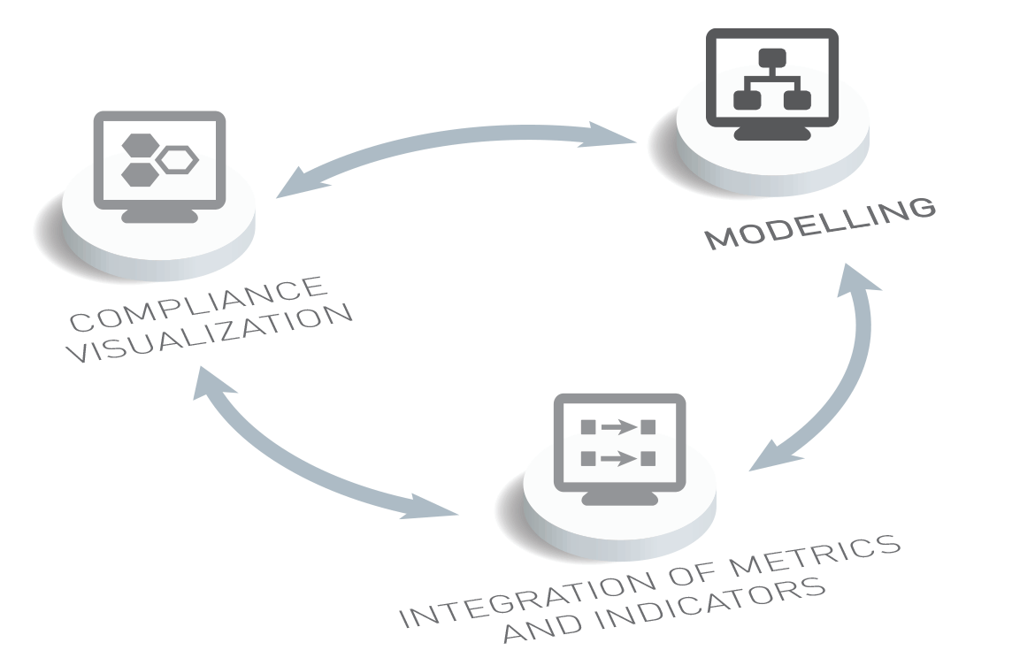
Service modelling in Obsidian
The modelling activity aims at:
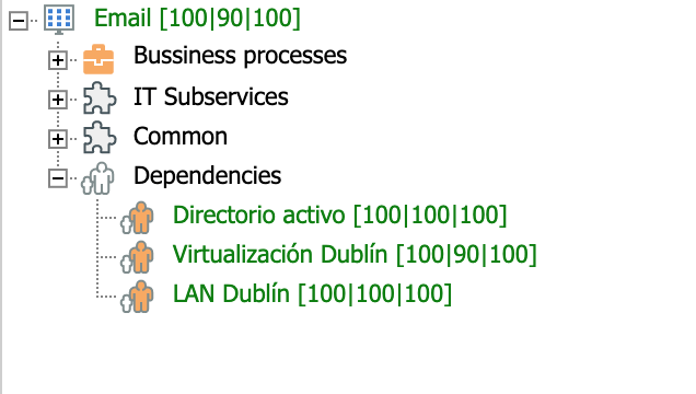
- Identifying dependencies among services, such as:
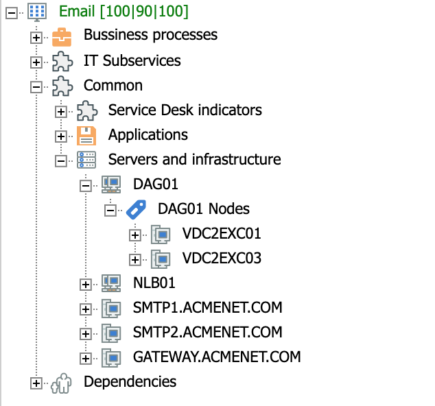
- Defining the elements that make up the service. For example, at the infrastructural level:
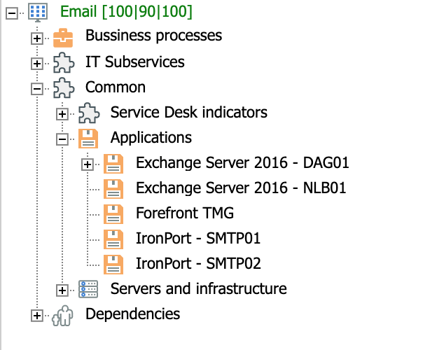
- Or, at the applications level:
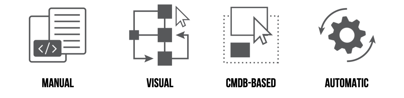
Service modelling in Obsidian can be performed in four main ways:
- Manual modelling.
- Visual modelling.
- Manual modelling from one or more CMDBs (or similar tools that provide the service architecture).
- Automatic modelling from one or more CMDBs (or similar tools).
Integration of metrics and indicators
Once the modelling is completed, the next key activity to operating Obsidian is the integration of metrics and indicators. These enable the quantification of the performance of modelled elements. In this way, following the propagation and criticality criteria defined while modelling, service-level performance can be automatically calculated and propagated to its dependencies.
For that purpose, Obsidian allows the obtention of metrics and indicators from all kinds of tools used by the organization, including:
- ITSM tools, mainly ticketing or service desk tools and CMBDs.
- Monitoring tools (infrastructure, network, applications, user experience, etc.).
- Cloud and devops tools (all kinds of virtualization platforms and containers, deployment environments, etc.).
- Business tools, which could provide useful information at the service and element levels.
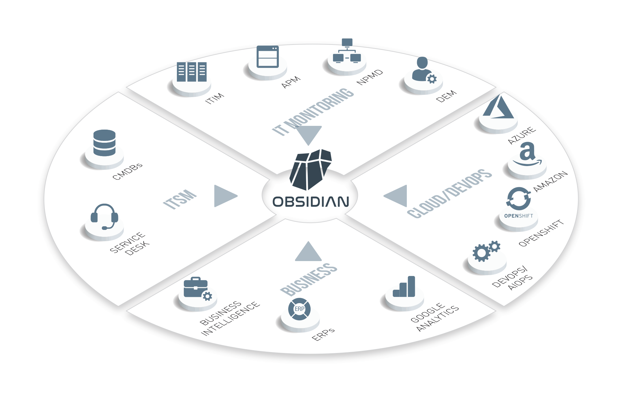
There are several ways to integrate corporate tools with Obsidian. Once a tool is integrated, it is possible to assign metrics and indicators to the modelled elements.
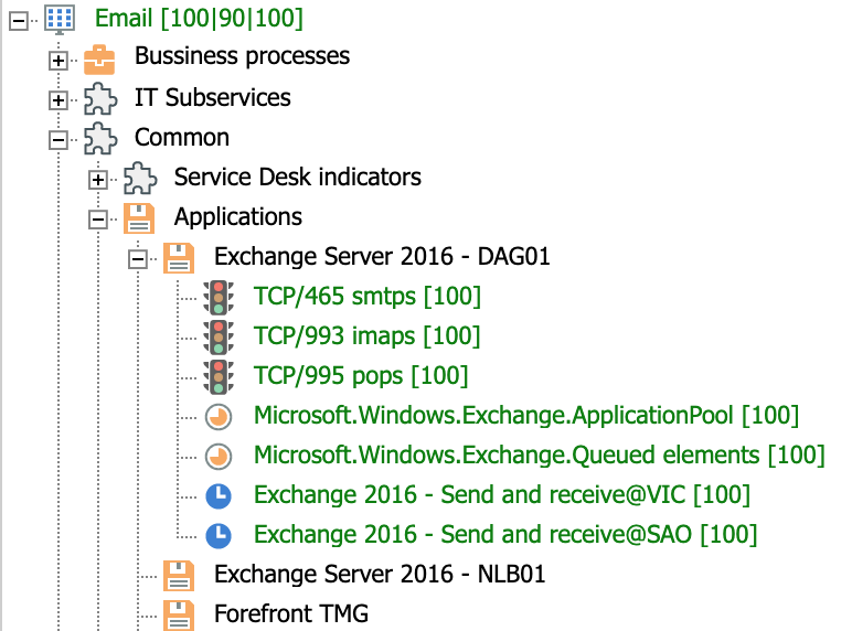
For example, the mapping of an application's availability and capacity probes:
Or, the mapping of a server's availability and capacity probes:
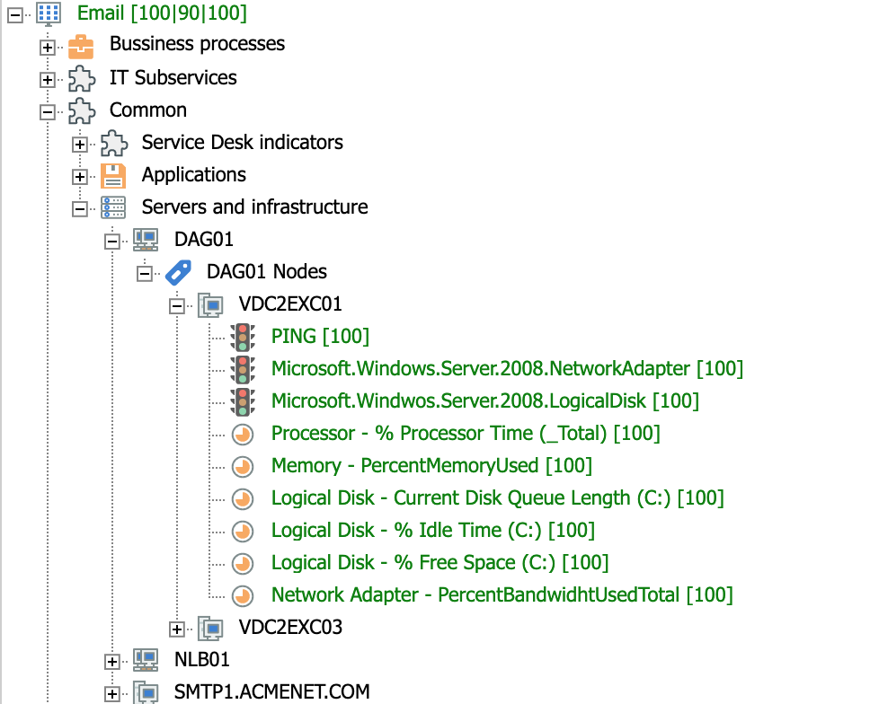
It is important to stress that this activity identifies probes, metrics or indicators that are relevant for evaluating the performance of a modelled element for each of the available analytical dimensions. In the standard Obsidian model, these dimensions are availability, capacity and service desk. The level of service is calculated from these dimensions.
Propagation of compliance levels
Once the probes, metrics and indicators have been mapped, the calculation engine in Obsidian will automatically start going through the modelling trees of each service in order to calculate their level of performance. Thus, when the modelled probes return a non-compliant value, this value spreads according to the propagation and criticality criteria defined for each level of the tree.
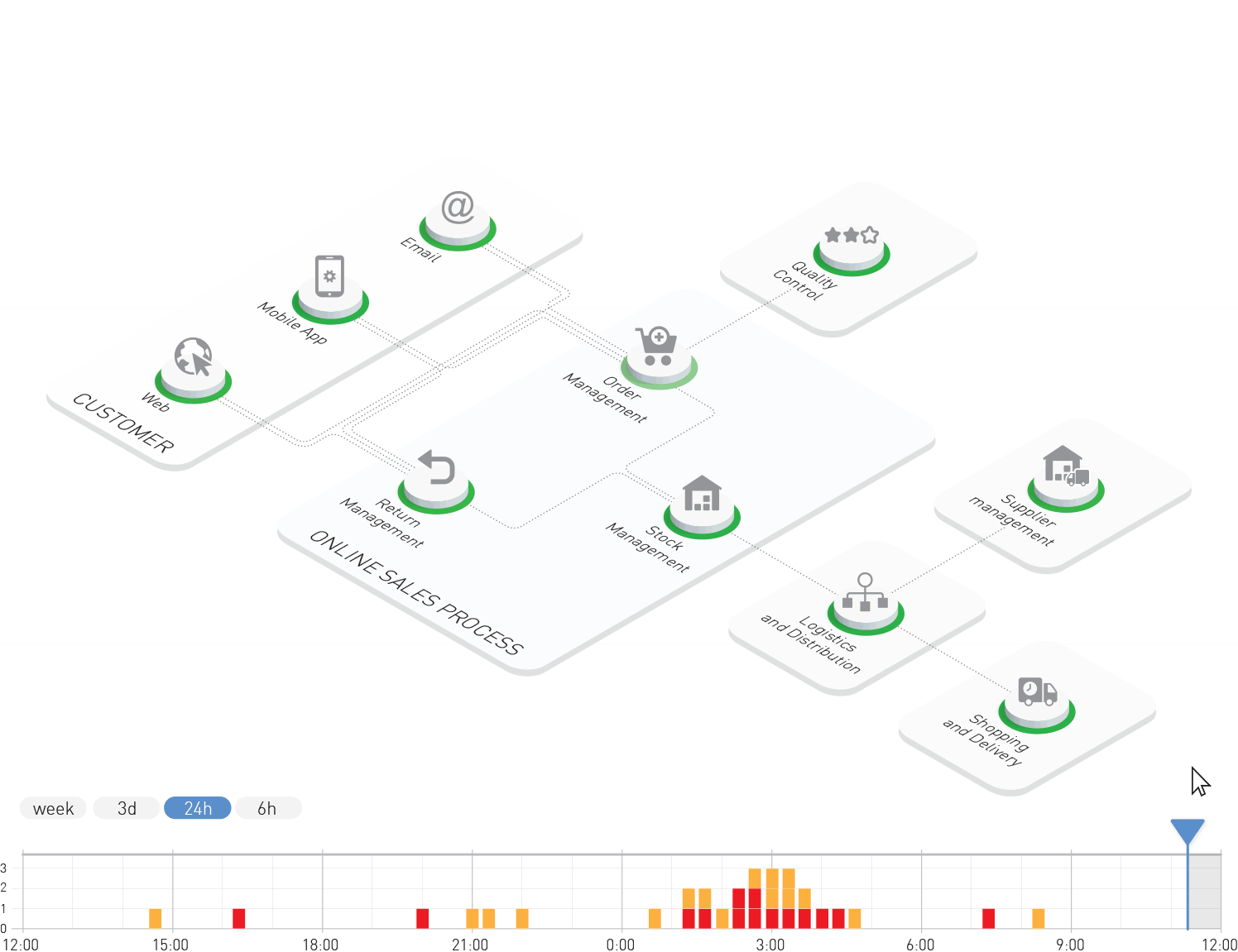
In this way, it is possible to calculate a non-compliance in a service which was caused by one of its elements:
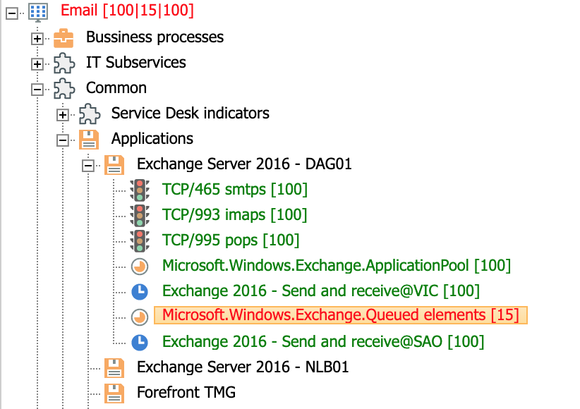
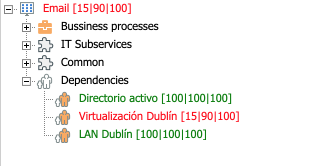
Or, a non-compliance at the service level is caused by a dependency on another service:
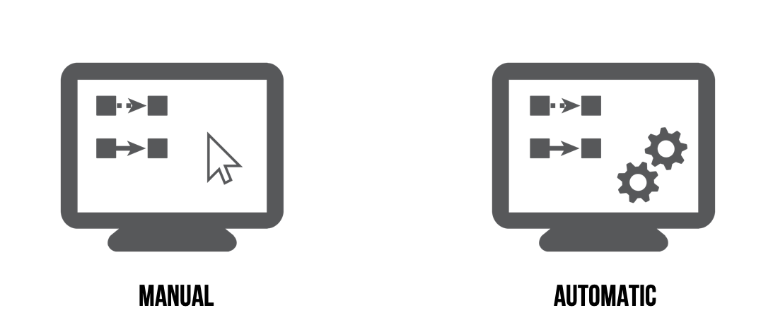
Just like it happens with the previous activity, this mapping or assigning activity can be performed manually or automatically. Although automation is always desirable, sometimes it can be difficult to define the criteria to implement this activity. For that reason, it is common to start with a manual approximation and progressively lay automation.
Compliance visualization
The third operational activity in Obsidian relates to visualization. Once the services are modelled, and metrics and indicators from corporate data sources are integrated, it is time to view the information. This allows users to have a real-time vision of the services' performance.
An Obsidian dashboard can mainly show two types of information:
- Quantitative indicators: Numeric values, percentages, time series, etc.
- Qualitative or categorical indicators, usually through the use of color coding, to show information about compliance, risk, impact or any other variable for which information can be translated into "red/yellow/green".
Where possible, Obsidian will tend to use the second type of dashboards, converting the existing quantitative information from corporate tools into qualitative indicators displayed through color coding. Thus, details may continue to be available for consultation in the original tool, but Obsidian provides aggregated information with a real-time focus and presented in an intuitive, easy-to-grasp way for nontechnical users.
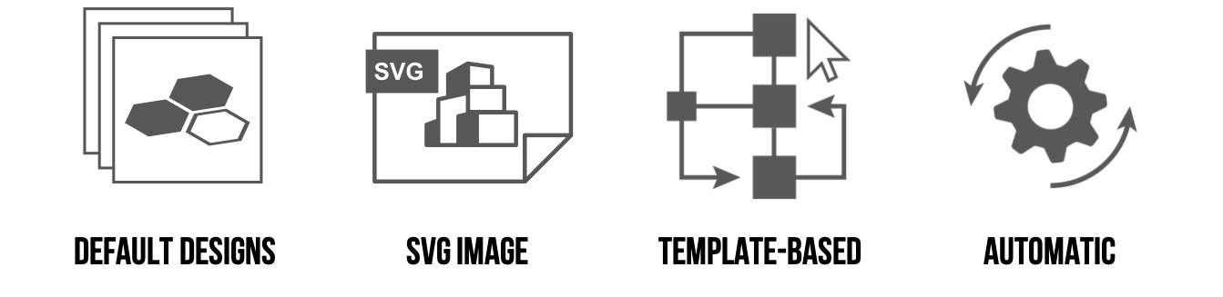
Compliance indicators in Obsidian can be represented in several ways: Standard dashboards that are available by default and require hardly any setting efforts, ad-hoc designs through SVG images, reusable SVG templates, or automatic designs that are generated in a dynamic way from the service modelling activity.
Below is a sample Obsidian dashboard that shows:
- Current (real-time) compliance information for the different activities of a business process and the impacts among them
- A timeline that allows the user to go back and view compliance levels at an earlier time
It is possible to consult a gallery of the main representation types that are available to include in Obsidian dashboards.